Primary Gradient
Symbolizes diversity, harmony and positivity.
Project Overview
Creating a distinctive visual identity for Musique Pour La Paix.
MPLP (Musique Pour La Paix) is a music-driven organization focused on spreading peace and harmony through the power of music. The goal was to design a modern, meaningful and versatile brand identity that reflects its mission and values.
Logo Variations
The logo is designed to work across different backgrounds and media, ensuring clarity, consistency, and strong recognition.
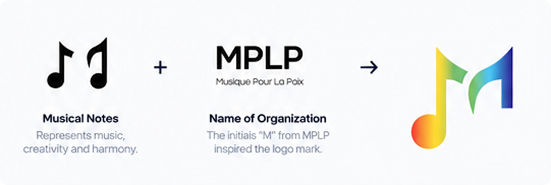
Logo Concept
The logo combines musical notes with the initial “M” to create a meaningful and memorable identity. The musical note represents music, creativity and positive energy, while the clean typography conveys trust and professionalism.
Color Palette
A vibrant rainbow gradient represents diversity, harmony and positivity, reflecting the organization's mission to spread peace through music. A deep indigo serves as the primary brand color, providing balance, professionalism and strong visual presence.
Symbolizes diversity, harmony and positivity.
#2A287B
Used for typography, backgrounds and key elements.
Used for illustrations, graphics and accents.
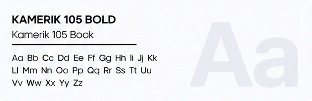
Typography
Kamerik 105 is a modern and clean typeface that gives the brand a contemporary and sophisticated look. The bold weight is used for the main logo, while the book weight is used for supporting text and communication.
Brand Application
The final logo works effectively across various platforms and media, from digital to event-based applications. The vibrant logo stands out while maintaining clarity and consistency.